 Schedule a demo of LiquidPlanner with a product expert today

Project Manager: “We’ve made good progress and expect to be finished with the project in approximately one month.”
Stakeholder: “One month?! I thought the whole project was only supposed to take a week! What changed?”
Project Manager: “Well, unfortunately, I didn’t drive my time machine to work today…”
Soon after your project gets underway, you might start wondering: “Is my project trending in the right direction?,” or “How is my project progressing compared to the original estimates?” Looking at historical data to see trends and comparisons will help you understand how you got to the current state of your project; it will also prepare you to answer tough questions from your most important stakeholders.
Remaining Trend and Total Trend Reports
Why you need it:
Trend reports in LiquidPlanner help you visualize the uncertainty of your project. At the beginning of any project, the gap between the low and high expected effort range is usually at its widest. This means that the uncertainty level is high. However, as the project progresses, this gap should narrow as the uncertainty decreases. Understanding how your project is trending can help you communicate why your project requires certain amounts of time, resources, or funding.
How to read it:
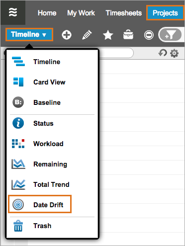
Run the Remaining Trend and Total Trend reports from the View Menu on the Projects tab.
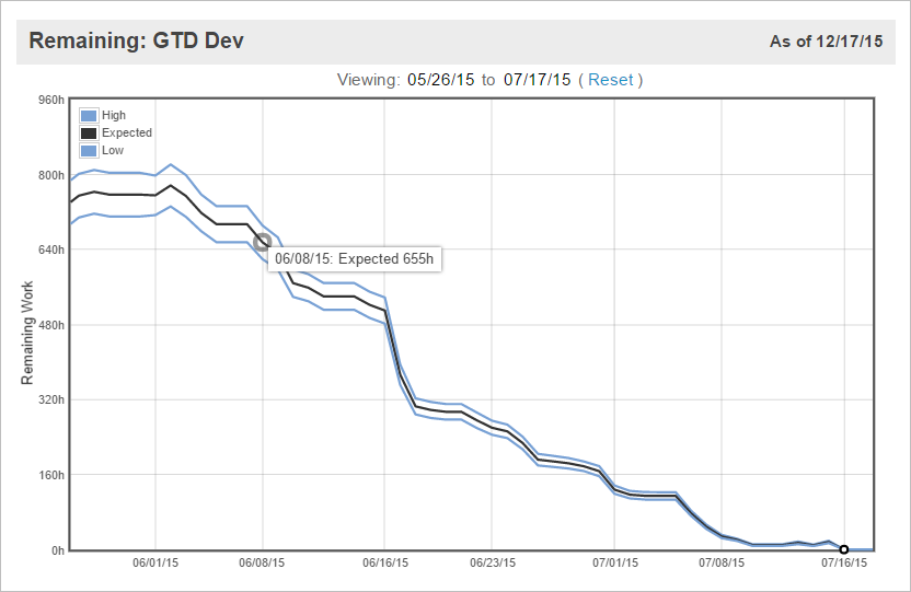
Running a Remaining Trend report on a project will show you how much work is left to do for the project over time. This report is also known as a burndown chart because, as the project progresses, the remaining work should continue to decrease until there’s no work remaining. A healthy project will show lines that slope downwards and then narrow continuously as time goes on. This means two things:
- Your ranged estimates are being reduced because there’s less remaining work as your team is completing their tasks.
- Your team is estimating with more certainty, so the estimates will have a smaller range, which narrows the gap between the low and high estimates.
To understand this, let’s think about effort estimates on the smallest scale: a single task.
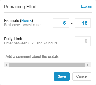
During the planning phase of a project, the task owner, Alison, estimates her work for this particular task at 10 – 40 hours of effort. This wide estimate is her best guess for now because she doesn’t have a lot of information about the task. The uncertainty is high.

After Alison starts working on the task and logs 5 hours of progress, LiquidPlanner automatically reduces the remaining estimate to 5 – 35 hours.
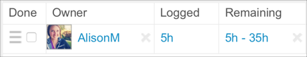
At this point, Alison is more familiar with the details of the task. She knows that she’ll be able to finish the work closer to her best case estimate, so she adjusts the remaining estimate to 5 – 15 hours.
This reduction in uncertainty at the task level impacts the effort roll-up and finish date for the entire project.

By encouraging task owners to adjust the ranged estimate whenever they have a better understanding of how long the task will take to complete, you’ll get a much more realistic macro view of how the overall project is trending.
Unlike the Remaining Trend, the Total Trend report will plot lines to show you how the overall total effort (logged + remaining) has changed over time. You’ll also be able to see how much work has been completed over time in the ascending green mountain at the bottom of the chart.
Here’s how you can tell whether your estimates are on the mark:
- Your project is trending in the right direction if the total work lines narrow continuously and don’t creep upwards or plummet downwards. Flat lines (no slope) across the x-axis (time) mean that the estimates from earlier in the project’s lifetime were a good reflection of the total effort or scope.
- A sign of either scope creep or consistent underestimation of tasks is reflected when the total work lines creep steadily upwards. If they creep downwards, this is a sign of overestimation or cutting scope to meet deadlines.
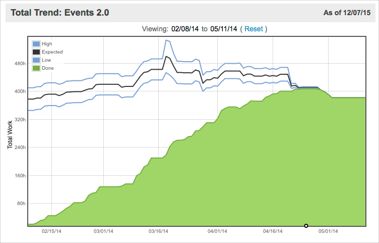
The green shaded area should steadily slope upwards to meet the total work lines. This indicates that hours are being logged at a steady pace as the project continues. If the green area plateaus, that tells you that work has stalled on the project or that team members are not logging their progress.
Frequently, the green mountain of completed work will show that healthy progress is being made; but the total work lines will also be creeping upwards. This is a sign that more work is being added as time goes on (scope creep) or that task owners are consistently underestimating their tasks. While your project might be taking longer than you initially expected, you’ll see trends like this occurring far in advance of the delivery date and be able to make any necessary adjustments. Remember that you can’t eliminate uncertainty from your project, but you can manage it.
How to share it:
To share trend reports, click the printer icon in the upper right of the report and use your browser function to save as a PDF.
Use the Date Drift Report
Why you need it:
The Date Drift report plots the expected finish date for a plan item over time. For a project, it shows you where the project was expected to exit at any point in it’s lifetime.
How to read it:
If the black line is flat (no slope), that means that your expected finish date has stayed the same. So, work is being done at a rate that will allow your project to finish on the date you originally planned for. Great job!
If the lines are sloping upwards to the right, that means that your expected finish date has slipped. This might happen if the work is taking longer than expected or if scope has been added.
If you have a deadline set on the item, that date will be plotted as a red line. A little bit of upward creeping is okay as long as the black expected finish line stays beneath the deadline in red.
In the example above, you can see that the gap between the earliest and latest finish dates narrows over time. This is a good sign that uncertainty in the plan is being reduced. However, the finish date for the project has also slipped by a couple of weeks, so the deadline was renegotiated to accommodate the slip in the schedule. Read on to Q #4: “What is putting my project at risk?” to find out more about schedule risk.
How to share it:
Click the printer icon in the upper right of the report and use your browser function to save as a PDF.
Use the Baseline View
Why you need it:
Once underway, your project can take some pretty wild turns that leave you wondering, “What happened to the meticulously crafted plan I laid out at the beginning?” At times like this, remember that your original plan should change to reflect reality, rather than adhering to the inputs that were entered at the start. Also, remember that LiquidPlanner’s scheduling engine is doing the work for you!
Because you get an updated schedule after each and every input that your project team enters, you don’t need to constantly compare planned versus actual to check the health of your project. By simply setting deadlines and max effort, LiquidPlanner will automatically tell you if your schedule is falling behind and will help you identify scope creep through the aforementioned trend reports. While seeing red in the plan can be alarming, it’s better to have that information up front so you can make adjustments before it’s too late. You’ll learn about identifying risks in the next part of this guide called, “What is putting my project at risk?”
All of that being said, you still need a way to look back to the past to understand why your project’s dates changed and to identify lessons learned for your next project. Baselines in LiquidPlanner allow you to compare your current plan to how it looked on an earlier date.
How to use it:
The key step to getting valuable comparison information out of LiquidPlanner is to define the start of your project by snapping a manual baseline. The start can look different for different teams, but ideally, the following has been completed:
- All of the work has been added to an active project in LiquidPlanner.
- Resources have been assigned to tasks.
- Estimates have been entered for the work.
- Project and tasks have been prioritized in relation to other work in the plan.
- A realistic deadline has been set on the project.
- Stakeholders have reviewed the plan.
- The project team has reviewed the plan.
When you’ve agreed upon the scope and the timeframe for delivering the project with your stakeholders and your project team, this becomes the benchmark that you want to capture as the true start for the project.
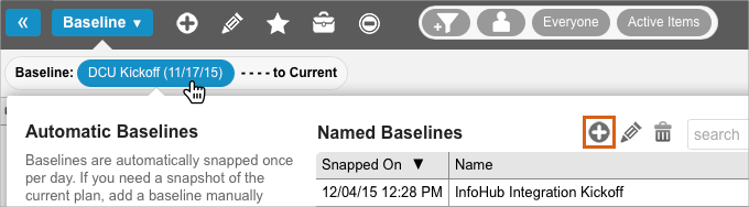
Next, you want to manually snap a baseline of your plan and give it a title like “Apollo Project Kickoff” so you can remember why you snapped the baseline at this exact time (down to the minute!). Later on, you’ll be able to use the baseline view and reports to see how your project is performing compared to how you thought it would at the beginning.
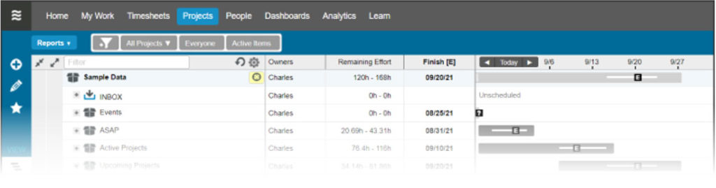
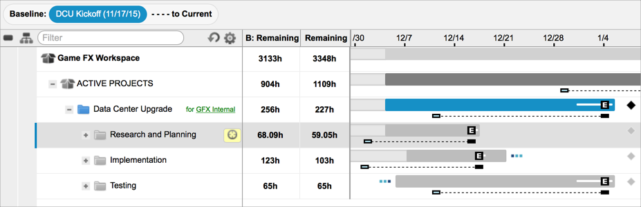
The Baseline View on the Projects tab is best for visualizing how your project has slipped and which tasks contributed to pushing out the project’s finish date. The longer the dotted line extends, the further the expected finish date of the project has slipped.
Remember that the calculated expected finish date takes into account the estimates, logged hours, priority, and availability of your resources, so it’s the single most important indicator of how your project is progressing. You can also expose other columns in the baseline view to compare a whole slew of metrics.
Here’s how you find out how your project’s original estimated effort compares to the amount of work you actually ended up doing:
- On the Projects tab, click on the View Menu and select Baseline.
- Click the date picker.
- Under Named Baselines, select your project’s kickoff baseline and click Compare.
- Click the yellow zoom filter next to the project to filter down to that project.
- Click on the gear icon, check the box for Total [E], and click Done.
Total [E] is the total expected effort (hours logged + remaining). This calculation works well for understanding changes in scope. On the baseline date, assuming no hours were logged, B: Total [E] represents the original remaining effort for the project. Fast forward to today, and the Total [E] column shows you the current hours logged plus any remaining hours. So, if the current value is higher than the baseline value, you know that the project required more hours than you originally anticipated.
The example below shows the baseline view for an active project called Blog Series. The baseline comparison date has been set to 11/03/15, which is a manually snapped baseline from the launch of the project.
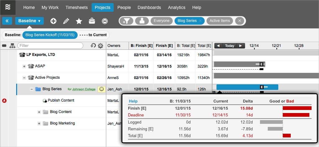
Here’s some of the at-a-glance information that we get:
- The remaining effort (Remaining [E]) has decreased.
- The total expected effort (Total [E]) has increased by about 4 days. This means that scope was added to the project after we originally estimated the work, or that the work was underestimated.
- The project’s expected finish (Finish [E]) has pushed out by about 15 days.
- The project’s deadline was re-negotiated to fall two weeks after the initial deadline.
There are many factors that could be contributing to the slippage of this project. The addition of scope is probably one of the largest contributors, but uncertainty in the initial estimates or slow progress are also possible reasons.
The next example shows a baseline comparison for a different project called Data Center Upgrade. The baseline data for this project tells a slightly different story:
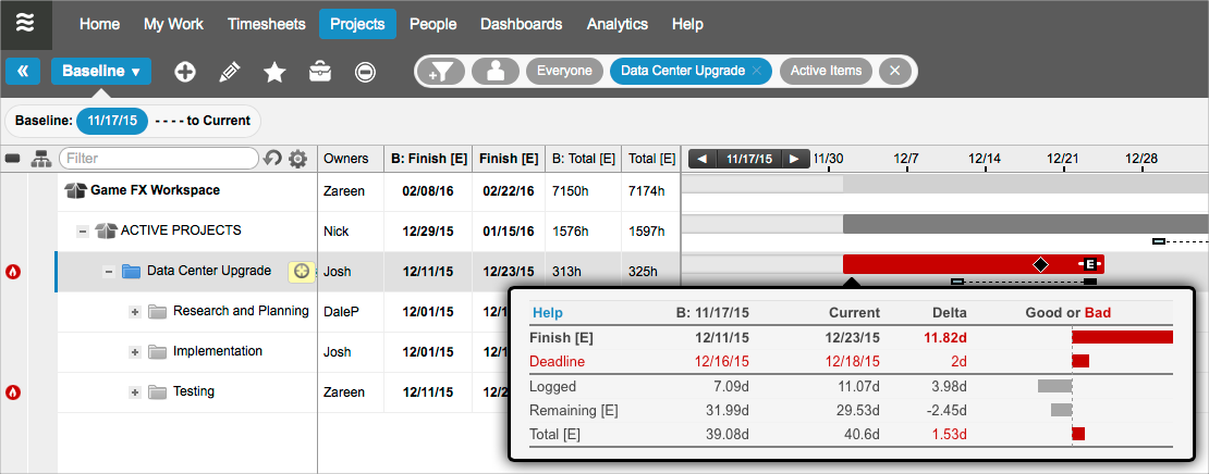
- The remaining effort (Remaining [E]) has decreased.
- The total expected effort (Total [E]) has increased by 1.53 days. This shows that the project’s scope has increased slightly since the baseline date.
- The number of hours logged as of the current date is greater than the number logged as of the baseline date. That’s good, however…
- The project’s expected finish (Finish [E]) has pushed out significantly. Since the scope was not increased by much, that can only mean that we haven’t logged enough hours to keep the project on pace with the baseline date projection.
From here, you want to dig into the reasons why progress is not being made. You’ll find this information at the task level. Start by looking for tasks with little or no time tracked. Although the project’s net scope decreased, see if there are any tasks that actually had a significant increase in effort, causing the rest of that resource’s work to push out. We’ll walk through how to find and report on some of this data in the next section of this guide called, “What is putting my project at risk?”
Use Baseline Analytics Reports
Why you need it:
While the Baseline View is an ideal quick-reference tool, Baseline Analytics reports are where to go when you need to dig deeper, see data across projects, and view graphical summaries.
How to use it:
- Go to the Analytics tab.
- Under New Reports, click Project Report and select Project Baseline.
- Click the filter icon, Filter by Project, and select your project.
- Click the baseline date and choose your Named Baseline for the project’s kickoff.
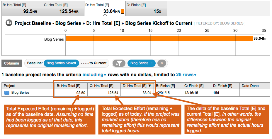
In Analytics, you’ll see a “D: Hrs Total [E]” column that will tell you the delta (difference) between the total expected hours on the baseline date and the current date. In other words, the delta value is telling you whether or not you were over or under your original scope (with a positive or negative number) and by how many hours.
The report below is showing that the Blog Series project is currently 33.04 hours over the amount that was originally estimated at the start of the project:
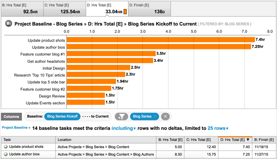
You can drill in further to see which individual tasks had the largest difference between their original estimates and the current amount of effort by clicking the project name in the data table:
How to share it:
Click Download in the upper right corner of the report and choose the CSV or PDF format.