 Schedule a demo of LiquidPlanner with a product expert today
The Total Trend report plots the total work (remaining effort plus logged progress) over time, so you can see the work expanding and contracting both in total work and range of uncertainty. The growing green mountain is the actual work done.
Use Total Trend
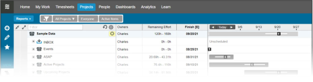
LiquidPlanner’s predefined reports are located in the Reports Menu on the Projects tab. Click Total Trend to view the Total Trend Report for a selected plan item.

To print the report, click the printer icon while in full-screen mode. To zoom into a particular region of the report, hover over the graph and use the cursor to select the region you want to focus on.

Understand the Report
Pick a point on any line, then watch the cursor popup. Selecting a point on the black or blue lines will show you the projected total number of hours to complete the project at that point in time. Selecting a point on the green mountain trend line will show the total hours logged at that point in time.
- The upper blue line is the worst-case (high) estimate of the total work (remaining work plus the progress recorded).
- The lower blue line is the best-case (low) estimate of the total work.
- The black line in the middle is the expected value of the total work.
The width between the lines represents the range of uncertainty, as defined by the high and low estimates on the work. Early in a project, specific details are usually unclear, so you might notice a wider gap between the “High” and “Low” lines. This gap is representing the natural uncertainty and wider estimates that are typical of a newer project. As project variables become more clear and as uncertainty is reduced, you should see lines narrowing. This phenomenon is known as the Cone of Uncertainty.

Your project is trending in the right direction if the high/expected/low lines narrow continuously and don’t creep upwards or plummet downwards. Flat lines (no slope) across the x-axis (time) mean that the estimates from earlier in the project’s lifetime were a good reflection of the total effort or scope. If the lines creep steadily upwards, this is a sign of either scope creep or consistent underestimation of tasks. If it creeps downwards, this is sign of overestimation or cutting scope to meet deadlines.
The green shaded area should steadily slope upwards to meet the total work lines — this indicates that hours are being logged at a steady pace as the project continues. If the green area plateaus, that is a sign that work has stalled on the project or that team members are not logging their progress.

Frequently, the green mountain of done work will show that healthy progress is being made, but the total work lines will also be creeping upwards, as shown in the example above. This is a sign that more work is being added as time goes on (scope creep) or that task owners are consistently underestimating their tasks. While your project might be taking longer than you initially expected, you’ll be able to notice trends like this far in advance of the delivery date and make any necessary adjustments. Remember that you can’t eliminate all uncertainty from your project, but you can manage it.
To learn more about using trend reports in LiquidPlanner, take a look at our guide on monitoring project performance over time.
Trend data for this report is not available for dates prior to 6/15/2013.