 Schedule a demo of LiquidPlanner with a product expert today
Widgets are the primary design element for Dashboards and Groups are the basis of the Dashboard Layout. Add Widgets and Groups to your Dashboard in Design Mode. The Widget Gallery has many options to choose from including work metrics, scheduling, properties, lists, notes, images and intake forms.
| 1 |
Widgets and Groups in View Mode # |
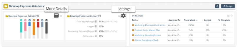
Groups provide control over widget size, position, filtering and scope. When viewing the dashboard in View Mode, grouped widgets are enclosed within the same border.
Clicking More Details on the Widget performs the action defined in Widget Settings. They can either expand into a view that shows more data, open a Plan Item Edit Panel, or navigate to another view in the Workspace.
Settings allows Project Managers to view and edit Widget Settings without leaving View Mode. Widgets inherit the Group’s scope and data filter settings.
This lesson covers widget set up and filtering for all the widget types except intake forms which are covered in their own lesson, Project & Task Intake Forms.
| 2 |
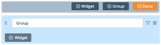
Add Widgets and Groups in Design Mode # |
When a Dashboard is created it has two sample groups and several widgets. Widgets are always in a Group. They can be created within the Group or dragged over from another Group. Widgets inherit the Group’s scope and data filter settings. When moved from one group to the next they automatically update to the new Group’s settings. Open Design Mode to add or edit Widgets and Groups.
+Widget opens the Widget Gallery. Select a Widget and Save it to the Dashboard.
+Widget in the header bar creates a new Widget and a new Group
+Widget in the Group adds the Widget to the bottom of the Group
+Group creates a new section on the left side of the Dashboard.
Done exits Design Mode, returning you to the Dashboard’s View Mode.
Read about formatting the Dashboard Layout with Groups and Widgets . . .
Formatting Groups
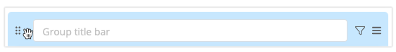
In Design Mode, use the dots to drag a Group and all its widgets to a new location on the Dashboard.
The default Group name in the title bar comes from its Scope. A Group’s default name doesn’t appear on the Dashboard. Enter a name for the Group if you would like one displayed.
To the right of the title bar, Group Filter opens the modal where Scope and Filtering are defined. Scope and Filtering are optional for a Group. When they are applied, all the Widgets in the Group inherit its settings.
The last icon on the right has Group Options which includes Size, +Widget, Duplicate, Delete. Duplicating or deleting a Group includes the Group and all its Widgets. The Group’s size can span the full width of the Dashboard, or half.
Formatting Widgets
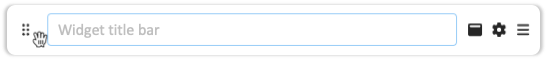
Use the dots to drag a Widget to another location in the Group or move it to another Group.
The default Widget name in the title bar comes from its Scope. This is the name that will appear on the Dashboard unless you enter a name of your own. This can also be entered in Settings.
To the right of the title bar, More Detail performs the action defined in Widget Settings. Clicking a widget can expand into a View on the Dashboard, open a Plan Item Edit Panel or navigate to another View in the Workspace.
Settings gear opens the modal for defining Scope, Filters and Widget Settings. Scope and Filtering are optional for most widgets. Each widget’s settings are explained later in this lesson.
The last icon on the right has Widget Options including Settings, Size, Duplicate, Delete. The Widget can span the full width of the Group, or half. Four widgets can span the width of a Dashboard when they are set to Half Size.
| 3 |
Widget Gallery in Design Mode # |
Widgets are located in the Widget Gallery which opens when clicking +Widgets in Design Mode. The remainder of this lesson explains widgets in detail. Widgets have different settings available which can be summarized as follows:
Have Data Filter Settings: Metrics Tally, Task Board, Workload, Plan Item Lists
Need to be Scoped to a Plan Item: Insights, Linked Note, Properties Summary, Schedule Summary
Expand into Views on the Dashboard: Changes, Metrics Tally, Plan Item Lists, Task Board, Workload
Have On-Click Settings that open the edit panel or navigate to another view: Properties Summary, Schedule Summary
Dashboard specific widgets: Dashboard Note and Image
Add new work: Project Intake Form and Task Intake Form
| 4 |
Changes # |
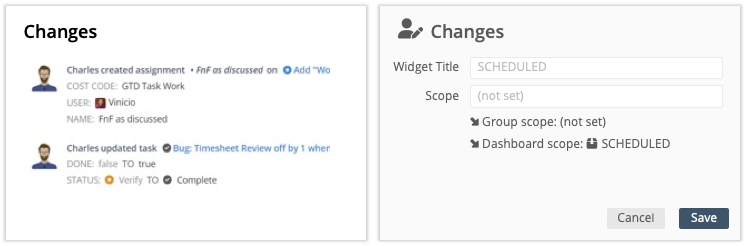
Changes Widget displays the five most recent changes on items captured within the scope and filter set. Clicking the widget in View Mode expands a Changes View on the Dashboard showing plan item changes made over the last 90 days (30 days for the FREE plan).
Expand to learn about scope, filtering and the expanded view for this widget . . .
Widget Title: incorporate filter parameters in the title so viewers understand which plan items are included in the widget and its Changes View.
Widget scope is optional. Use it to narrow scope and filters inherited from Group and Dashboard settings.
Interactivity in View Mode: clicking a Task link opens the Edit Panel. Clicking a Project or Sub-Folder navigates to the task list in Project View. Clicking a Package takes you to its Package View.
Click to expand the widget
When viewers click the Changes Widget in View Mode, it expands to show all plan items captured within the Widget Scope, plus scope and filters on the Group and Dashboard. See the Changes & Deleted Items lesson for more about monitoring workspace updates.
Return to View Mode by clicking the orange button at the top of the screen.
| 5 |
Dashboard Note # |
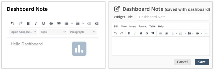
Apply Notes to your Dashboard using a rich text editor that supports text formatting, images, hyperlinks, code sample, special characters, emoticons and time stamps. In View Mode, clicking the widget expands the Note so it can be edited or viewed more easily.
Expand to learn about formatting this widget . . .
Widget Title: add a title that catches your viewers’ attention.
Create tables in the widget or paste in spreadsheet data from other programs such as Excel.
Use the Help tab in the widget editor to explore shortcuts, keyboard navigation and plugins.
Scope and Filters: this widget doesn’t require scope and it isn’t affected by scope and filtering on the Group or Dashboard.
Save closes the editor and returns to Design Mode.
Interactivity in View Mode: click on the widget to open the editor and update the note without going to Design Mode. Project Manager access required.
| 6 |
Image # |
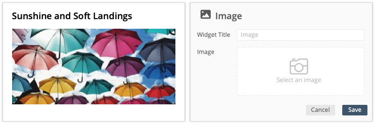
Add Images to the Dashboard. Supported file types include: BMP, GIF, ICO, JPEG, PNG, SVG, TIFF, WEBP. Entering a title is optional. Save closes the editor.
| 7 |
Insights # |
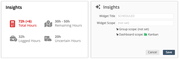
Insights widget collects Schedule and Work Metrics in a simplified view. Scope the widget to a Package, Project or Sub-Folder to monitor progress and keep things moving in the right direction.
Expand to learn about scoping this widget and interpreting insights. . .
Widget Title: incorporate filter parameters in the title so viewers understand which plan items insights are being displayed.
Scope: this widget needs to be linked to a plan item through either the Widget, Group or Dashboard scope. If scope has not been set in at least one area, a warning appears:  Scope needs attention.
Insights Widget Dashboard View
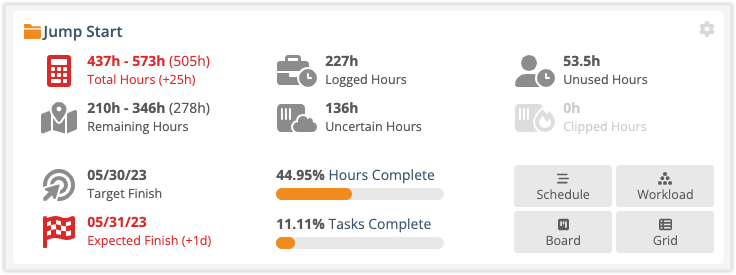
The Insights widget displays Schedule and Work Metrics. The metrics are roll ups calculated from the widget’s scope. If a metric’s value is 0 the insight is grayed out. Jump from the Dashboard to another view using the Schedule, Workload, Board and Grid buttons.
Total Hours is represented by the calculator. The equation for Total Work is Hours Logged + Remaining Estimate = Total Work. Hours are presented as a range with the mean in parenthesis in the upper row. When a Work Limit is set the Delta is displayed. The insight turns red when Total Work is more than the Work Limit. Negative Work Deltas mean Total Work is under the Work Limit (that’s a good thing!).
Remaining Hours are represented by the map with a location dot. Hours are presented as a range, with the mean in parenthesis on the upper row. Remaining estimate is used to calculate expected Start and Finish dates. The estimate decrements automatically when people track time.
Target Finish is the deadline date.
Expected Finish date is calculated by the algorithm. When a Target Finish date is set, the Target Date Delta is displayed. When Expected Finish is after the Target Finish, the insight turns red. A positive Delta is the number of days past the Target Finish date.
Logged Hours are represented by the briefcase with a timer.
Uncertain Hours are represented by a sensor cloud. This metric represents the difference in hours between the best case and worst-case estimates. Some uncertainty should be expected, but if you’re concerned about the gap between Expected Finish and Latest Finish, then these hours need to be reduced.
Sliders represent the Total Percent Complete in hours and tasks. Percentages increase as hours are logged and tasks are marked done.
Unused Hours are represented by the person with the timer. These are the hours left over from assignments marked done before the Remaining Estimate reached 0-0. They can be allocated to other work.
Clipped Hours are represented by a fire sensor. These are the hours that won’t be completed because the Target Finish date is set to “Stop Scheduling.”
| 8 |
Linked Note # |
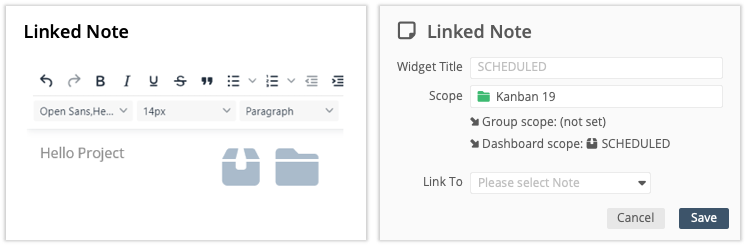
Linked Note displays the information in the Notes field on the Edit Panel of a Package, Project or Sub-Folder. In View Mode, clicking the widget expands the Linked Note so it can be edited or viewed more easily.
Expand to learn about scope and filtering for this widget . . .
Widget Title: include the plan item and note field names in the widget title so viewers know what they’re looking at.
Scope: this widget needs to be linked to a plan item through either the Widget, Group or Dashboard scope. If scope has not been set in at least one area, a warning appears: Scope needs attention.
Link To: select the Note to display. Be sure to select a plan item that falls within the scope set on the Dashboard, Group or Widget. Scope needs attention appears when you link to a note on a plan item that is outside their boundaries. If you forget to link the note after setting the scope, “Linked Note could not render” displays. Open settings and select a note to clear the error.
Save closes the editor and returns to Design Mode.
Interactivity in View Mode: click on the widget to open the editor and update the note without going to Design Mode. Project Manager access required.
| 9 |
Plan Item List Widgets: Package, Project, Sub-Folder, Task and Assignment # |
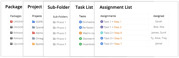
Plan Item List widgets are custom tables displaying schedule data, work metrics and properties associated with Packages, Projects, Sub-Folders, Tasks or Assignments. These display up to 5 columns and 20 rows in View Mode. Clicking the widget expands into a Grid View on the Dashboard with more data.
Expand to learn about table design, scope and filtering for this widget . . .
Design Package, Project, Sub-Folder, Task and Assignment List widgets by selecting columns to display on the widget in View Mode and set up additional columns for the Grid View that expands when the widget is clicked.
The widget and the view are interactive. Clicking a plan item link on the widget in View Mode opens its Edit Panel. When the widget is expanded to Grid View, viewers can adjust columns, edit plan items and download data. Go to the Grid View lesson to learn about working in this view. Adjusting columns in the Dashboard Grid does not affect the widget columns in View Mode.
List Widget Settings
List Widgets are all set up the same way. Setting widget scope and filters is optional. Use them to narrow scope and filters inherited from Group and Dashboard settings.
Save closes the editor and returns to Design Mode.
List Widget Filter Example
| 10 |
People List Widget # |
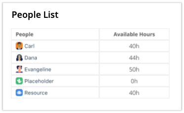
Use the People List Widget to display hours, work and schedule metrics by Member, Resource and Placeholder. Apply a date range filter to see their availability and workload within the time period. A user will appear in the widget when they have work assigned to items within the dashboard location. For example, a People List widget in a Project Dashboard will include everyone with work assigned to the project. Similar to the Item List widgets described above, it displays up to 5 columns and 20 rows in View Mode. Select the widget to expand it into a Grid View where more rows and columns are shown.
Expand to learn about columns in a People List Widget. . .
Profile Columns: Username, First Name, Last Name, Groups, User Status, User Type, Custom Data Fields
Work Metric Columns: Logged, Uncertain Hours, Unused Hours
Item Count Columns: Project Count, Task Count, Assignment Count
Utilization Columns: these require a date range to calculate results, without a date range they display N/A.
Total Availability (h): number of hours someone is available during a time period. Availability is reduced when they have time off.
Workload: when Workload is higher than Total Availability it means they tracked more time than their available hours in a time period. This metric has four components:
Logged (h) + Unlogged (h) + Scheduled (h) + Available (h)
Logged (h): time tracked during the time period (usually in the past).
Unlogged (h): a positive number represents hours someone was available but they didn’t track time. Negative indicates more hours were logged than available, contributing to Workload being out of balance with Total Availability.
Scheduled (h): hours scheduled during the time period (always in the future).
Available (h): hours someone is available during the time period but they don’t have anything scheduled (they could take on work).
% Availability Used: percentage of total availability that’s scheduled during the time period for work in the report location (workspace, package or project).
Total Work Scheduled: hours scheduled during the time period + hours logged during the time period.
| 11 |
Metrics Tally # |
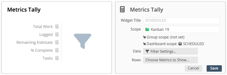
Displaying Metrics on the Dashboard makes it easy to follow along with the work and status of plan items. Metrics are tallied based on scope and filters set on the Widget, its Group and the Dashboard. Choose Metrics to display on the widget and when viewers click it will expand into a list showing all metrics.
Expand to learn about scope, filtering and setting the display for this widget . . .
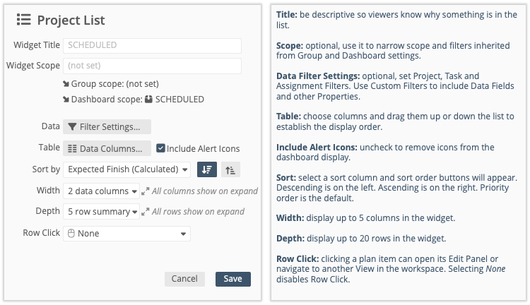
Title: be descriptive so viewers know what the tally includes.
Scope: optional, use it to narrow scope and filters inherited from Group and Dashboard settings.
Data Filter Settings: this widget can have Project, Task and Assignment filters. Use Custom Filters to include Custom Data Fields or other properties. Widget filters combine with Group and Dashboard filters.
Rows: select metrics to display in the widget and set the order to display them in View Mode. Choose from Work Metrics, and counts by Plan Item, Schedule Status and Task Status. You may display all the metrics on the widget in View Mode.
Save closes the editor and returns to Design Mode.
Click to expand the widget
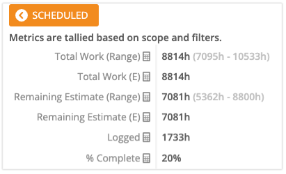
In View Mode clicking the Metrics Tally Widget expands a Metrics View on the Dashboard showing tallied metrics for everything falling within the scope and filters applied to the Widget, its Group and the Dashboard. The expanded Metrics View does not follow the same order as the widget. Rows are listed by Work Metrics, then counts by Plan Item, Schedule Status and Task Status.
Return to View Mode by clicking the orange button at the top of the screen.
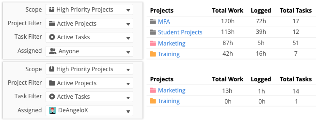
Metrics Tally Filter Example
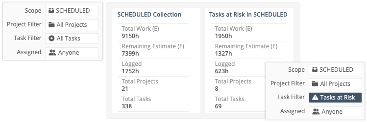
The example above shows shows two Metrics Tally widgets displayed on a Workspace Dashboard. Both widgets are scoped to the SCHEDULED Collection. The widget on the left has no filters applied. It displays metrics for all Projects and All Tasks assigned to Anyone in the SCHEDULED Collection.
The Metrics Tally widget on the right with the same scope has a Task Filter for Tasks at Risk. The filter reveals there are 8 Projects with Tasks at Risk in the SCHEDULED Collection for a total of 69 Tasks at Risk. The Metrics for Total Work, Remaining Estimate and Logged Hours reflect the hours tallied up from those tasks.
| 12 |
Properties Summary # |
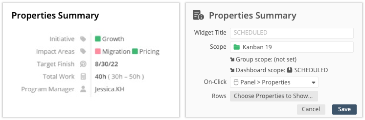
Properties Summary includes all the data associated with a plan item. Select what you want to show on the widget in View Mode and set the click action for viewers. Clicking the widget can open a tab on the Edit Panel or navigate them to another view in the workspace.
Expand to learn about scope, filtering and setting the click action for this widget . . .
Widget Title: include the scoped plan item name in the widget title so viewers understand why properties are displayed.
Scope: this widget needs to be linked to a plan item. Scope needs attention displays when scope inherited from the Group and Dashboard is too broad. Use the widget scope to select a plan item.
On-Click: set the click action for viewers clicking on the widget.
Disable On-Click: None.
Navigate to the Scoped Plan Item’s View: Board, Changes, Dashboard, Grid, Schedule, Workload.
Open a tab on the Scoped Plan Item’s Edit Panel: Planning, Scheduling, Properties, Notes, Changes.
TIP: for the best viewer experience, select a location that corresponds to the properties shown in the widget. For example, if Schedule Metrics are shown, navigate them to Schedule View. If Custom Data Fields are displayed, choose Properties on the Edit Panel. In some cases it may make sense to set up multiple Properties Summary widgets on your Dashboard
Rows:display Work Metrics, Target Dates & Deltas, Work Limit & Work Limit Delta, Scheduling, Schedule Dates, Schedule Status, Plan Item Name, Assignments, Counts, Percent Complete, Location, Cost Code, Created By, Created On, Description. Organizations on PROFESSIONAL and ULTIMATE Plans can display Custom Data Fields in the Properties Summary widget.
Save closes the editor and returns to Design Mode.
| 13 |
Schedule Summary # |
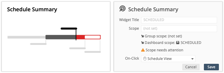
Schedule Summary displays the schedule rollup for a Package, Project or Sub-Folder. Select a plan item and set the click action for viewers. Clicking the widget in View Mode can open a tab on the Edit Panel or navigate to another view in the workspace.
Expand to learn about scope, filtering and setting the click action for this widget . . .
Widget Title: include the scoped plan item name in the widget title so viewers know which schedule they’re looking at.
Scope: this widget needs to be linked to a plan item. Scope needs attention displays when scope inherited from the Group and Dashboard is too broad. Use the widget scope to select a plan item.
On-Click: set the click action for viewers clicking on the widget.
Disable On-Click: None.
Navigate to the Scoped Plan Item’s View: Board, Changes, Dashboard, Grid, Schedule, Workload.
Open a tab on the Scoped Plan Item’s Edit Panel: Planning, Scheduling, Properties, Notes, Changes.
Save closes the editor and returns to Design Mode.
For more about scheduling see lessons covering the Introduction to Schedule Bars and Target Dates & Deltas.
| 14 |
Task Board # |
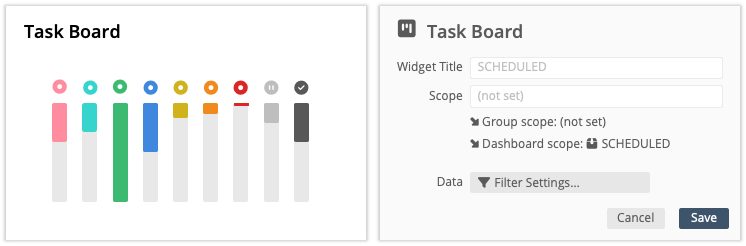
Task Board is a Custom Task Status Meter that changes as tasks move from one status to the next. Clicking the widget expands into a Board View in the Dashboard displaying Tasks captured within the scope and filter set.
Expand to learn about scope, filtering and the expanded view for this widget . . .
Widget Title: incorporate filter parameters in the title so viewers understand which Tasks are included in the widget and its Board View.
Widget scope is optional. Use it to narrow scope and filters inherited from Group and Dashboard settings.
Data Filter Settings: this widget can have Project, Task and Assignment filters. Use a Custom Task Filter to specify Task Statuses included in the widget if you don’t want to display them all. Widget filters combine with Group and Dashboard filters.
Task Board Filter Example
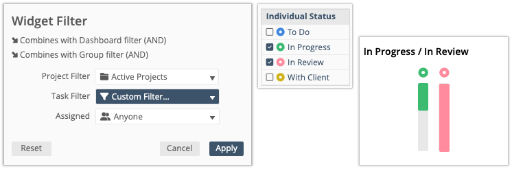
In this example a Custom Task Filter is used to select just two statuses to display in the widget, “In Progress” and “In Review.”
Click to expand the widget
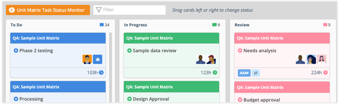
When viewers click on the Task Board Widget in View Mode, a Board View expands displaying Tasks within the scope and filters applied to the Widget, the Group and the Dashboard.
Board View is interactive on the Dashboard. Dragging tasks to the left or right changes their schedule status in the workspace. Clicking on a card opens the Task Edit Panel. See the Board View lesson to learn about managing tasks in this view.
Return to View Mode by clicking the orange button at the top of the screen.
| 15 |
Workload # |
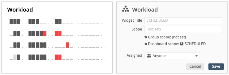
Workload shows how work is distributed over 60 days with the heaviest load on top. The top five appear in the widget, to see more click it to expand a Workload View in the Dashboard.
Expand to learn about scope, filtering and setting the click action for this widget . . .
Widget Title: include filter parameters in the widget title so viewers know where the workload comes from.
Widget Scope is optional. Use it to narrow scope and filters inherited from Group and Dashboard settings
Data Filter Settings: this widget can have Project, Task and Assignment filters. Use Custom Filters to include Custom Data Fields or other properties. Widget filters combine with Group and Dashboard filters. Workspaces on the Ultimate Plan can filter by member Group.
Save closes the editor and returns to Design Mode.
Click to expand the widget
Clicking the Workload Widget in View Mode expands into a Workload View in the Dashboard listing everyone matching the Assignment filters with work assigned during the time period. Expand rows to see Tasks falling within the scope and filters applied to the Group and Dashboard.
The view is interactive. Use the drop down menu in the upper right corner to show how work is distributed over 30, 60, 90 or 180 days. Click on a Task to open the Edit Panel. Click someone’s name and go to their personal Workload. Adjusting the number days in the expanded view doesn’t affect the widget display in View Mode. The widget will always show Workload over 60 days.
Return to View Mode by clicking the orange button at the top of the screen. See the Workload View lesson to learn about this view.
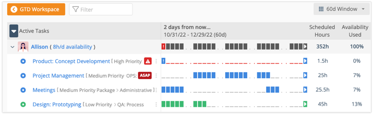
Workload Filter Example
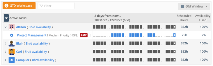
When the Workload widget is filtered, Scheduled Hours shows the total roll up for all work in the time period and the task list is reduced to items matching the filter. Members and Resources are included in the Workload view when their work falls within the scope and filters on the Widget, its Group or Dashboard. This example from a Workspace Dashboard uses the ASAP Task filter to show everyone with Tasks that have priority overrides, ASAP in the Project, ASAP in the Package, ASAP in the Workspace.


