 Schedule a demo of LiquidPlanner with a product expert today

Project Manager: “Jackie, it looks like your work for this project isn’t going to get done by our deadline. Is there anything blocking you?”
Jackie: “What work?”
People are at the center of every project. You need to see what your team is working on across all projects. This way, you can make sure that the distribution of work is allocated efficiently to keep your project on schedule.
Data that pertains to workload, distribution, and availability will help you understand what effect your resources are having on the progress of the project. Set up teams in LiquidPlanner to take advantage of filtering and reporting capabilities.
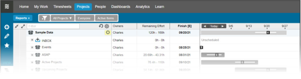
Use the Project Workload Report
Why you need it
The Project Workload Report on the Projects tab helps you understand team utilization and workload distribution. When you run this report on a specific project, you can instantly see which days your team will be working on your project, days they’re not scheduled for any work on the project, and any deadline risks that they might be causing.
How to use it
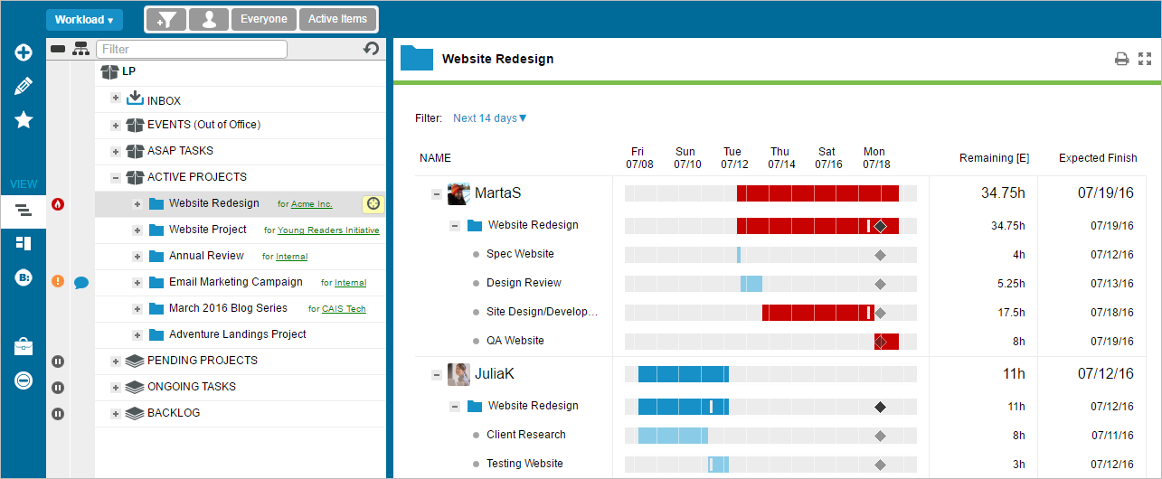
The workload bars for each resource shows you how the remaining hours for the selected project are distributed across the timeframe for the project, as well as the expected finish date for that resource’s portion of the work. This is really helpful for manual load balancing.
In the example below, you can see that Marta’s workload bar is red — she has 34.75 hours remaining and is expected to finish all of her work for the project on 7/19, putting the Website Redesign at risk for missing it’s deadline. You can also see that Julia only has 11 hours remaining and she’ll be done with her work much sooner. Your next step would be to re-assign some of Marta’s tasks to Julia by opening the edit panel for Marta’s red tasks directly in the report. Remember that adding work for a resource in a higher priority project will impact that person’s lower priority assignments. You can use the Resource Workload (covered in the next section) to see Julia’s workload beyond just this one project, and make sure you won’t be delaying her on other time-sensitive work.
How to share it
Save the report by clicking on the printer icon in the upper right of the Project Workload Report and use your browser’s print functionality to save as a PDF.
Resource Workload Report
Why you need it
The Resource Workload Report on the People tab allows you to see workload by person across all projects. The report gives you visibility into when a person has available hours, when work is assigned to them, or when they have work that is at risk. This feature is available in Enterprise edition workspaces.
How to use it
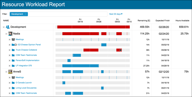
You can use the Resource Workload report to get a sense for how your team is doing across all of their work in the near term or months out into the future. Filter the report to your team or a specific group of people. Then set the specific timeframe for your report, based on the timeframe of workload issues you need to resolve (example: Next 30 days).
In the example below, some of Nadia’s work is at-risk because her workload bars are red. By expanding Nadia’s workload bar, it’s easy to find out which item(s) are at risk. Before re-assigning Nadia’s at-risk work to someone else, you can look at what other work she has around the same time and determine if moving task priorities around might help address the deadline risk. Since the Resource Workload Report shows workload across multiple projects, it’s easy to see what other project work is taking priority.
The alternative course of action may require shifting work to another person. In this case, you can include Anne’s workload side-by-side in this report to determine if she can take on Nadia’s work, and get it done before the deadline.
Note: The Resource Workload Report is accessible and visible to all real members of your workspace. However, there is not a PDF version of the Resource Workload Report, or a view to share it externally.
Filter in the Timeline View
Why you need it
The Timeline View on the Projects tab is the best place to manage resource assignments and scheduling, because you can immediately see the effect of any change on the project’s timeline.
How to use it
Filter to a person or a team on the Projects tab to see how your resources are being utilized. If you see large gaps in time when you look at the schedule bars, you may want to re-prioritize items or re-assign them so that your resources aren’t sitting idle. Remember that even if a resource is not able to work on a higher priority task due to a delay or dependency, LiquidPlanner will automatically schedule them to work on a lower priority item in the meantime. Gaps in the schedule are rare, and are usually a result of a resource being under-loaded.
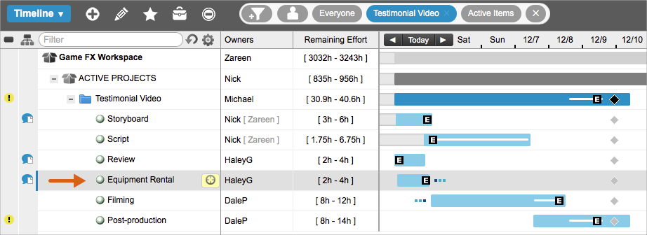
In the scenario below, we are filtered to the Testimonial Video project and we can see that Dale’s work is pushing out the finish date of the entire project past the deadline. We also know from running the Workload Report on this project, that Dale is doing the lion’s share of the work.
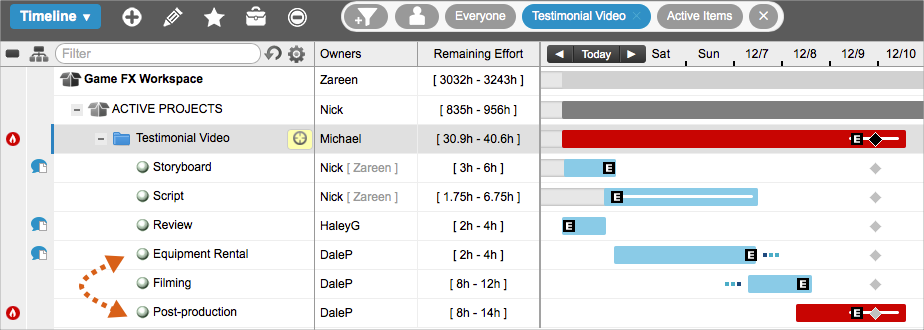
We want to distribute the workload across the project team a bit more evenly; so we’ll look for a task that Dale owns, that he hasn’t started to work on, and assign it to a different resource with a similar skillset.
Since we also know that Haley is under-loaded on this project, and that she has the skills necessary to execute the work, we’ll re-assign Dale’s Equipment Rental task to her, which will pull in the finish date of our project.
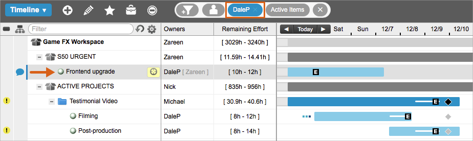
Now, we’re in much better shape, but Dale’s post-production work now shows a yellow warning alert, which means his task is pushing the 98 percent likely finish date of the project past the deadline. So, we’ll remove the project filter and then filter to Dale to see what he’s working on outside of the Testimonial Video project. We can see that he has a higher priority task that he has to complete before he can start filming. The next step is to consult with Dale as well as his manager to re-assess his priorities.
How to share it
You can share a view of the project’s timeline by using PDF Snapshot to capture a specific aspect of the plan along with the schedule bars. Alternatively, you can add a Projects View widget to a dashboard that you share with external guests.
Use the Analytics Resource Report
Why you need it
Imagine being able to look into the future to see the projected allocation of hours for your entire project team, along with the availability of a single resource to take on more work. And, all from the same report!
This Analytics report will show you the amount of work (in hours) each person has scheduled within a given date range, and it will also show you how many hours they have free. Unlike other views and reports, specific date ranges can be applied in Analytics to surface past logged hours and future remaining hours.
How to use it
As a project manager, running a Resource Report in Analytics helps you see past and future workload by person for a specific project.
- Go to the Analytics tab.
- Under New Reports, click Resource Report and select Person Roll-up.
- To find your project, click on the filter icon and select Filter by Project.
- Set a date range.
The following graph shows the hours for the Testimonial Video project within a three-week window:
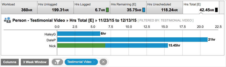
When filtering to a project, Analytics will pull in any resource that has hours logged or remaining for that project within the date range. The blue bars show that all three resources have remaining work left to do. The green bars show the number of hours that have been logged. This allows you to visualize the amount of effort that has gone into the project, see the effort that remains, and identify what resource the effort is associated with. You can drill down further by clicking a member’s name in the data table to see the specific tasks that are being represented in their workload value.
If you manage a functional team, you can also get a sense for resource capacity by running a Team Roll-Up report and looking at your team’s past logged hours and future remaining hours across all of their work. To do this:
- Go to the Analytics tab.
- Under New Reports, click Resource Report and select Team Roll-Up.
- To filter down to the members of a specific team, click a team name in the data table.
- Set a date range.
Here’s a quick explanation of the information you’ll see in this report:
- Workload – hours that a resource is available for work. (It’s possible for this number to be higher than the resource’s set availability if your date range includes past dates and the resource logs overtime, which is time beyond their availability.)
- Hrs Unlogged – hours that the person had available, between the beginning of the selected date range and now, minus hours logged during that period.
- Hrs Logged – hours already logged during that period.
- Hrs Remaining [E] – expected hours of scheduled work that remain during the period.
- Hrs Unscheduled – hours a person has available, i.e., no work is scheduled during the period.
- Hrs Total [E] – the total expected hours (Hrs Logged + Hrs Remaining [E]).
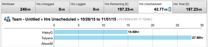
If you want to know whether a team or resource has the capacity to take on more work in the future, you’ll want to use a date range that includes future dates, like “next week,” “next month,” or “last week + 30d.” Here’s an example of what this looks like:
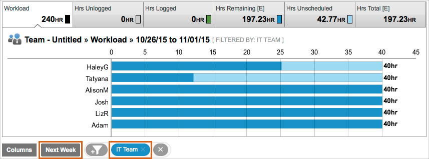
If a resource has the capacity to take on more work in the future, the number of hours they have available within the date range can be seen in the Hrs Unscheduled value:
How to share it
Click Download in the upper right of the report and choose the CSV or PDF format.
Build a Team Capacity Dashboard
Why you need it
You can build a team capacity dashboard to serve as a one-stop shop for all of the resourcing data that is most important to you.
How to use it
Start by thinking about your audience and build your dashboard to present the most important information for those viewers.
- On the Dashboards tab, click + Dashboard.
- Give your dashboard a title, like “Apollo Project Team Capacity.”
- Click + Widget.
The following widgets are helpful to have on a team capacity dashboard:
- Analytics Table – filtered to a single project, showing hourly metrics or counts with row type set to person.
- Donut Chart – filtered to a single project, showing Hrs Remaining [E] or Hrs Total [E] by person.
In the following example, you can see a team capacity dashboard for the Data Center Upgrade (DCU) project. Every widget is filtered to that project, showing hours, resources, and counts for the DCU project only.
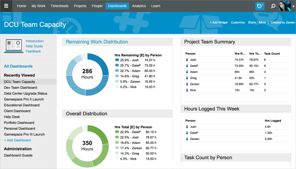
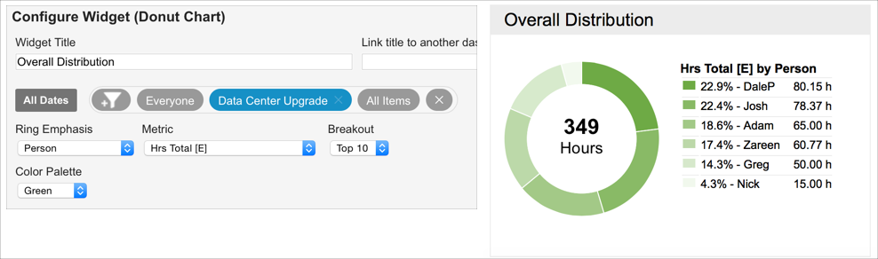
Total [E] is the total effort, which includes past hours logged and future expected hours. In the following donut chart, we can see that the entire DCU project is expected to take 349 hours. We can also see the distribution of that effort across all resources that are assigned to tasks within the project. This is a great way of gaining insight into how your team’s effort is distributed across a single project.
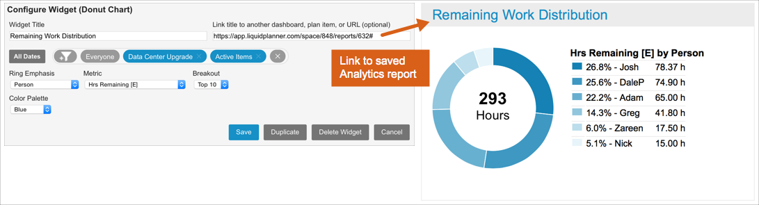
Remaining [E] is the amount of effort that is still left to complete. Seeing the breakdown by person gives you an idea for how balanced the remaining work is across the project team. If you need more information on the tasks that are contributing to a specific person’s workload, you can create an Analytics resource report to drill in further. The title of the widget below is linked to a saved Analytics report. This way, workspace managers and administrators can quickly access the exact report they need for more information on team utilization.
How to share it
You can share your team capacity dashboard with other workspace members and external guests. You can invite them to view your dashboard by clicking the Share link. Once you provide access, viewers can see real-time data at any time. See the Dashboards article for full details.