In our last article, we quickly discussed the four key phases LiquidPlanner customers experience when they first begin using the product: onboarding, adoption, refining, and optimization. Then, we detailed the onboarding phase.
Today, we’ll focus on adoption and how to gain insights into your team’s usage of LiquidPlanner.
Adoption
After onboarding, we move into adoption. By the time you’re in the adoption phase, your team should be consistently tracking time, and it has become more of a habit. Hopefully, other habits have formed, such as updating task estimates when scope changes and marking tasks as complete. In the adoption phase, you start to see those early wins from using LiquidPlanner.
The adoption phase covers these three topics:
- Team reports to see how your team is using LiquidPlanner and tracking time.
- Activities reports to gain insight into how much time is spent on various activities.
- Dashboards to align your team on priorities and updates.
Analytics: Person Roll-Up Report
In the adoption phase, it’s important to make sure team members feel comfortable using LiquidPlanner. Anytime you transition to a new tool, change is hard. One of the most important things that help keep the entire portfolio up to date is making sure everyone tracks time, and if some people aren’t getting it, forget to sometimes, or just don’t want to, it’s important to check in on those folks and help them out.
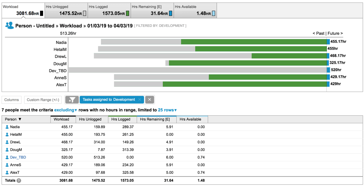
Under the Analytics tab, you’ll find the Person Roll-Up Report, which shows who has been logging their time over the last 90 days of onboarding in the Hrs Logged column.
On the flip side, you can double-check to see what’s happening in the Hrs Unlogged column. These are hours that people have available for projects but didn’t end up logging time to. This column can be an indicator of two things:
- They aren’t tracking time or forgot to track time, but they did work on projects.
- They didn’t have enough project work assigned to them, and the time was underutilized.
The Person Roll-Up Report is recommended when you want to see how things are going with your team and if they are keeping up with tracking time to their tasks.
Analytics: Activities Roll-Up Report
Taking a look at our next report, you’ll see why it’s helpful when your team members keep their time updated in LiquidPlanner.
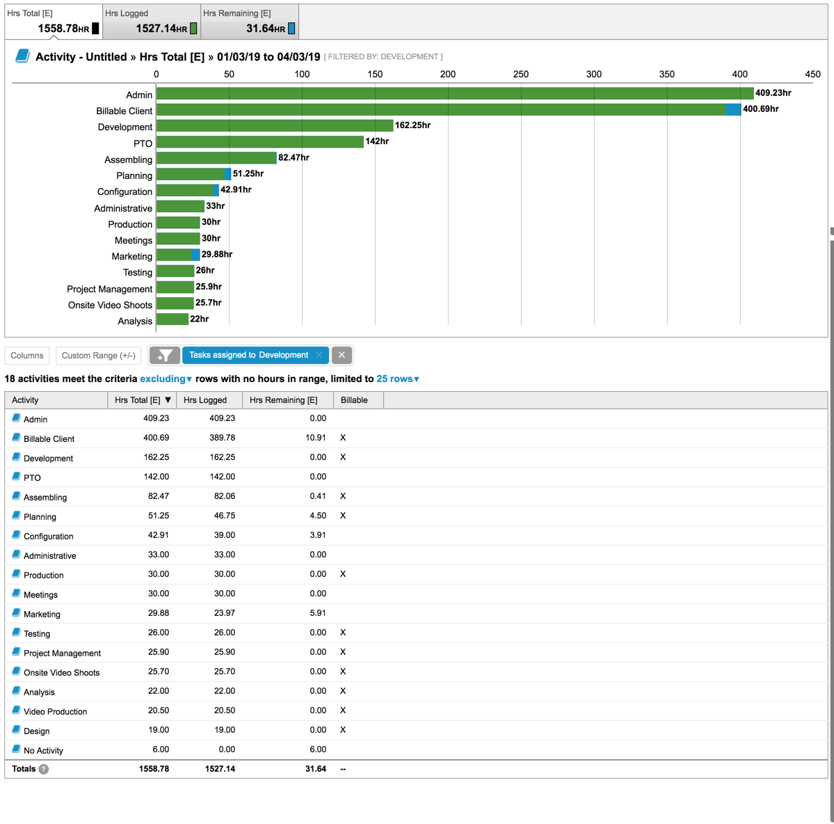
Also under the Analytics tab, the Activities Roll-Up Report breaks down the types of activities you’re tracking time against. You can filter the report to your team and see how much time they’ve tracked against different activity types over the last 90 days or whatever date range you want to drill into.
Many of our customers must be attuned to how much time they spend on billable work versus nonbillable work; for some companies, it helps to distinguish work that is capitalized versus noncapitalized. During the adoption phase, we’ve had customers who just started using LiquidPlanner, and they expected their distributed teams were spending about 60 percent of their time on new product or new development initiatives. After having their team members track time for three months, the data showed that it was more like 40 percent of their time, while the remaining 60 percent was spent on support work and ongoing activities. This reality check allowed the customer to reset expectations, change team member availability in LiquidPlanner, and also look at what was needed to raise the bar so the team members could spend 60 percent of their time on high-value work.
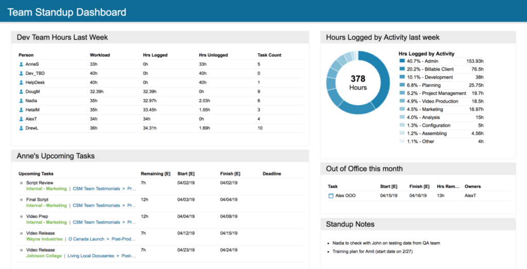
Team Dashboard
It’s always a good thing when managers and team members are aligned on priorities. Because those priorities can change quickly, it’s important to update LiquidPlanner when those priorities shift.
As the last tool of the adoption phase, Dashboards offer an efficient way to share these updates and can be used in weekly staff meetings or stand-up meetings.
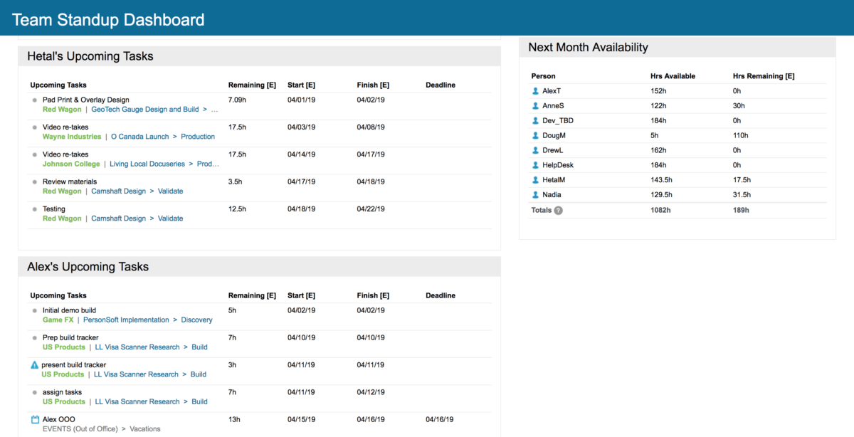
In this example, each team member’s top five or top ten priorities are visible. You can use this type of dashboard in meetings, taking ten seconds with each team member to make sure everyone agrees with the priorities they have set in LiquidPlanner. If something isn’t prioritized correctly, you can quickly update it during the meeting.
You can also add other widgets to your dashboards.
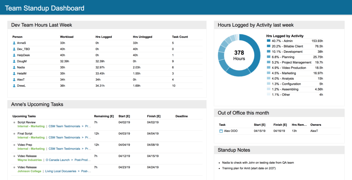
The donut chart is a visual display of the same activity information shown in the Activities Roll-Up Report; it might be interesting for your team members to see where they’re spending their time and, if that fluctuates, having discussions around what drove those fluctuations. An analytics table can keep everyone accountable for logging their time each week. Sometimes an open notes widget is useful to keep track of interesting notes, issues, or follow-up items in your team meetings. An out-of-office widget can be used in case anyone needs to back up team members when they’re on vacation.
In the next part of this series, we’ll look at the final two phases of the LiquidPlanner experience: refining and optimization.