
People are at the center of every project. You need to see what your team is working on across all projects. This way, you can make sure that the distribution of work is allocated efficiently to keep your project on schedule.
You don’t want to be caught up in conversations like this:
Project Manager: “Jackie, it looks like your work for this project isn’t going to get done by our deadline. Is there anything blocking you?”
Jackie: “What work?”
LiquidPlanner gives you data that helps you stay on top of what team members are working on throughout a project. Better yet, this data that pertains to workload, distribution, and availability will help you understand what effect your resources are having on the progress of the project.
In this blog we’re going to show you how to use the data in LiquidPlanner to answer a very crucial project question:
“How is my team doing?”
To start, here are four ways to get data about your project team:
Tip: Set up teams in LiquidPlanner to take advantage of filtering and reporting capabilities.
Using the Workload Report
Why you need it:
The Workload Report helps you understand remaining hours at a high level. You can run this report on any container (package, project, sub-folder) in the workspace. For example, when you run this report on a specific project, you can see which days your team will be working on your project; days they have work dedicated to another project, and days they’re not scheduled for any work. You can even select the workspace root at the very top of your plan to see workload across all resources for all projects.
How to use it:
The Overall Workload graphic shows you how the remaining hours for the selected project are distributed across your team members. This is really helpful for manual load balancing. For instance, if you see that Dale has 67 percent of the work share and Haley only has 8 percent, your next step would be to go to the Timeline View and filter to those resources to see if it’s possible to re-assign any of Dale’s tasks to Haley.
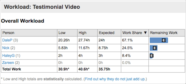
The Work Distribution chart shows you how each person’s work is distributed across calendar days. You can specify a date range for the distribution chart by clicking the downward pointing arrow in the Work Distribution header. Make sure to check the box that only includes members with work within the selected container. This way, you’re focusing only on the project team.
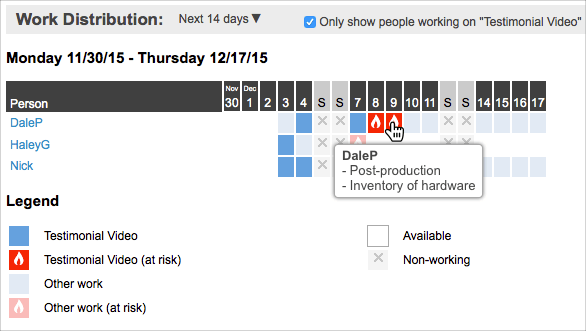
In the distribution chart, a dark blue square means the resource will be working on tasks for the selected container on that day. A light blue square means that the person has work scheduled that day, but it’s not for the container that is currently selected. Hover over any square and you’ll see a list of the specific tasks. A white square means that the person has no work scheduled that day. If you see that a resource has gaps in their work distribution (white squares), or if they have at-risk work on a particular day (red squares), you’ll want to go back to the Timeline View and filter to that resource to take a look at the schedule. Read on to the next section, “Filtering in the Timeline View,” to find out what to look for.
How to share it:
Save the report by clicking on the printer icon in the upper right of the Workload Report and use your browser’s print functionality to save as a PDF.
Filtering in the Timeline View
Why you need it:
The Timeline View on the Projects tab is the best place to manage resource assignments and scheduling, because you can immediately see the effect of any change on the project’s timeline.
How to use it:
Filter to a person or a team on the Projects tab to see how your resources are being utilized. If you see large gaps in time when you look at the schedule bars, you may want to re-prioritize items or re-assign them so that your resources aren’t sitting idle. Remember that even if a resource is not able to work on a higher priority task due to a delay or dependency, LiquidPlanner will automatically schedule them to work on a lower priority item in the meantime. Gaps in the schedule are rare, and are usually a result of a resource being under-loaded.
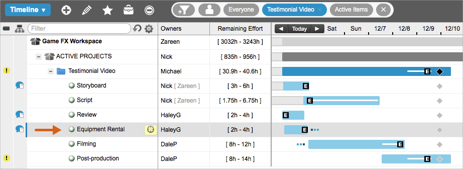
In the scenario below, we are filtered to the Testimonial Video project and we can see that Dale’s work is pushing out the finish date of the entire project past the deadline. We also know from running the Workload Report on this project, that Dale is doing the lion’s share of the work.
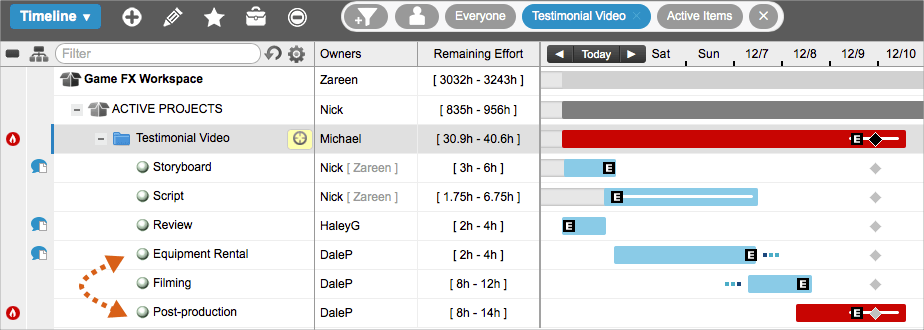
We want to distribute the workload across the project team a bit more evenly; so we’ll look for a task that Dale owns, that he hasn’t started to work on, and assign it to a different resource with a similar skillset.
Since we also know that Haley is under-loaded on this project, and that she has the skills necessary to execute the work, we’ll re-assign Dale’s Equipment Rental task to her, which will pull in the finish date of our project.
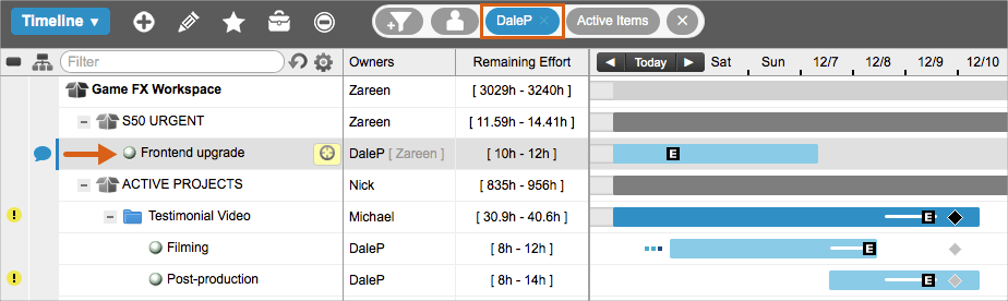
Now, we’re in much better shape, but Dale’s post-production work now shows a yellow warning alert, which means his task is pushing the 98 percent likely finish date of the project past the deadline. So, we’ll remove the project filter and then filter to Dale to see what he’s working on outside of the Testimonial Video project. We can see that he has a higher priority task that he has to complete before he can start filming. The next step is to consult with Dale as well as his manager to re-assess his priorities.
How to share it:
You can share a view of the project’s timeline by using PDF Snapshot to capture a specific aspect of the plan along with the schedule bars. Alternatively, you can add a Projects View widget to a dashboard that you share with external guests.
Using the Analytics Resource Report
Why you need it:
Imagine being able to look into the future to see the projected allocation of hours for your entire project team, along with the availability of a single resource to take on more work. And, all from the same report!
This Analytics report will show you the amount of work (in hours) each person has scheduled within a given date range, and it will also show you how many hours they have free. Unlike other views and reports, specific date ranges can be applied in Analytics to surface past logged hours and future remaining hours.
How to use it:
As a project manager, running a Resource Report in Analytics helps you see past and future workload by person for a specific project.
- Go to the Analytics tab.
- Under New Reports, click Resource Report and select Person Roll-up.
- To find your project, click on the filter icon and select Filter by Project.
- Set a date range.
The following graph shows the hours for the Testimonial Video project within a three-week window:
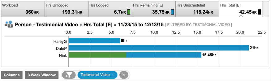
When filtering to a project, Analytics will pull in any resource that has hours logged or remaining for that project within the date range. The blue bars show that all three resources have remaining work left to do. The green bars show the number of hours that have been logged. This allows you to visualize the amount of effort that has gone into the project, see the effort that remains, and identify what resource the effort is associated with. You can drill down further by clicking a member’s name in the data table to see the specific tasks that are being represented in their workload value.
If you manage a functional team, you can also get a sense for resource capacity by running a Team Roll-Up report and looking at your team’s past logged hours and future remaining hours across all of their work. To do this:
- Go to the Analytics tab.
- Under New Reports, click Resource Report and select Team Roll-Up.
- To filter down to the members of a specific team, click a team name in the data table.
- Set a date range.
Here’s a quick explanation of the information you’ll see in this report:
- Workload – hours that a resource is available for work. (It’s possible for this number to be higher than the resource’s set availability if your date range includes past dates and the resource logs overtime, which is time beyond their availability.)
- Hrs Unlogged – hours that the person had available, minus hours logged during that period.
- Hrs Logged – hours already logged during that period.
- Hrs Remaining [E] – expected hours of scheduled work that remain during the period.
- Hrs Unscheduled – hours a person has available, i.e., no work is scheduled during the period.
- Hrs Total [E] – the total expected hours (Hrs Logged + Hrs Remaining [E]).
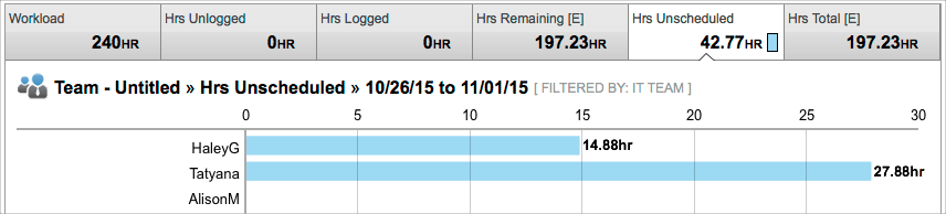
If you want to know whether a team or resource has the capacity to take on more work in the future, you’ll want to use a date range that includes future dates, like “next week,” “next month,” or “last week + 30d.” Here’s an example of what this looks like:
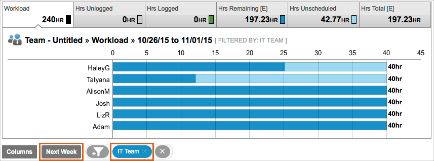
If a resource has the capacity to take on more work in the future, the number of hours they have available within the date range can be seen in the Hrs Unscheduled value:
How to share it:
Click Download in the upper right of the report and choose the CSV or PDF format.
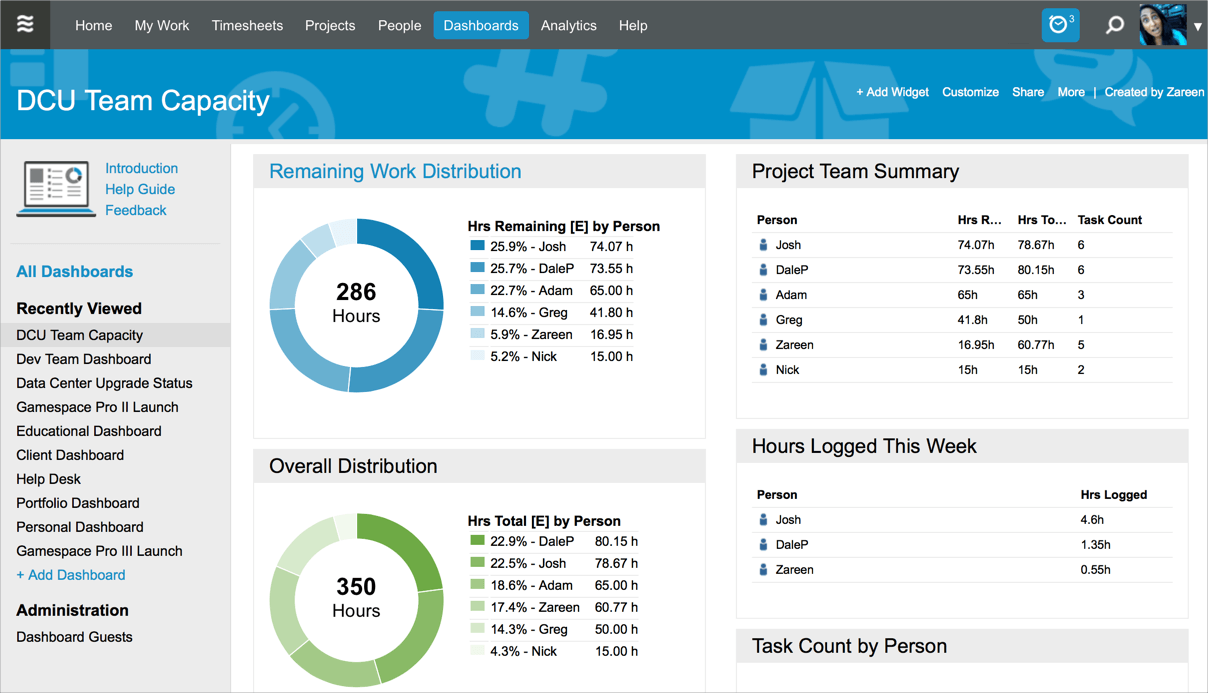
Building a Team Capacity Dashboard
Why you need it:
You can build a team capacity dashboard to serve as a one-stop shop for all of the resourcing data that is most important to you.
How to use it:
Start by thinking about your audience and build your dashboard to present the most important information for those viewers.
- On the Dashboards tab, click + Dashboard.
- Give your dashboard a title, like “Apollo Project Team Capacity.”
- Click + Widget.
The following widgets are helpful to have on a team capacity dashboard:
- Analytics Table – filtered to a single project, showing hourly metrics or counts with row type set to person.
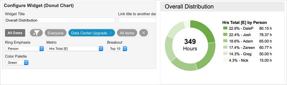
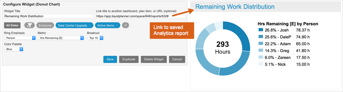
- Donut Chart – filtered to a single project, showing Hrs Remaining [E] or Hrs Total [E] by person.
In the following example, you can see a team capacity dashboard for the Data Center Upgrade (DCU) project. Every widget is filtered to that project, showing hours, resources, and counts for the DCU project only.
Total [E] is the total effort, which includes past hours logged and future expected hours. In the following donut chart, we can see that the entire DCU project is expected to take 349 hours. We can also see the distribution of that effort across all resources that are assigned to tasks within the project. This is a great way of gaining insight into how your team’s effort is distributed across a single project.
Remaining [E] is the amount of effort that is still left to complete. Seeing the breakdown by person gives you an idea for how balanced the remaining work is across the project team. If you need more information on the tasks that are contributing to a specific person’s workload, you can create an Analytics resource report to drill in further. The title of the widget below is linked to a saved Analytics report. This way, workspace managers and co-owners can quickly access the exact report they need for more information on team utilization.
How to share it:
You can share your team capacity dashboard with other workspace members and external guests. You can invite them to view your dashboard by clicking the Share link. Once you provide access, viewers can see real-time data at any time. See the Dashboards article for full details.
To learn more ways to use data for project information, go to the full-meal deal on our website:
Using LiquidPlanner Data to Monitor and Analyze Your Projects.
Up next week: Using LiquidPlanner Data to See How your project is performing over time.